Visually striking quilt projects designed for fat quarters, with practical guidance on color coordination, block layout, and turning mixed bundles into cohes...
The Quilt Mark
October 22, 2026
Mixing Fabric Scale, Print, and Value
Learn to mix quilt fabrics with confidence using scale, print, and color value. Simple, practical steps for balancing bold prints and creating contrast that reads beautifully.

Clara Jenkins
Clara Jenkins is an avid quilter and fabric enthusiast who has been designing and piecing together quilts for over twenty years. She shares her passion for color coordination, block design, and practical sewing techniques to help makers of all skill levels create beautiful, lasting heirlooms. Through Quiltmark, Clara aims to make the timeless art of quilting accessible, joyful, and deeply rewarding for everyone.
Updated October 22, 2026
I still remember the first time I tried to “make it work” with a stack of pretty fabrics. Up close, they were all lovely. Sewn together, my quilt top looked like a single busy blur, like I had stirred my stash with a wooden spoon. If you have ever stood at your cutting table thinking, Why doesn’t this look like the quilts I admire? the answer is often not your piecing. It is usually fabric selection, specifically how scale, print, and color value are (or are not) playing nicely together. (And yes, layout, pressing, and seam allowances matter too. But fabric choices are one of the fastest ways to change what your quilt “reads” from across the room.)
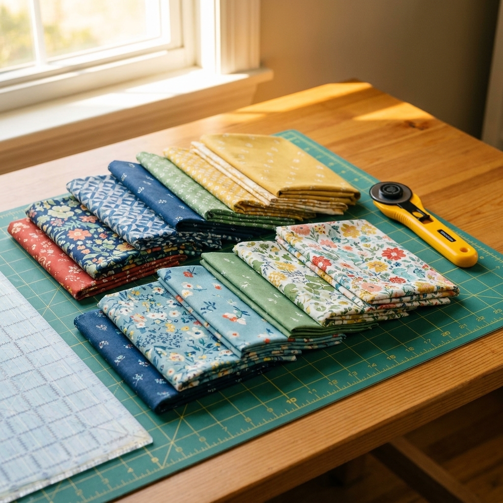
Let’s make fabric mixing feel less like a gamble and more like a skill you can repeat on purpose, even when you are stash-busting.
Start with three fabric jobs
Before we talk rules, here is the mindset shift that makes everything easier. In a quilt, fabric has three main jobs:
- Scale creates rhythm and breathing room.
- Print adds personality, movement, and sometimes visual noise.
- Color value builds the structure, the “read” of the block from across the room.
When a quilt feels muddy or chaotic, it is often because all the fabrics are doing the same job at the same intensity. When a quilt feels crisp and intentional, those jobs are distributed.
Mix scale on purpose
Scale is simply the size of the print’s shapes compared to the pieces you are cutting. A large floral can be gorgeous, but if you chop it into 2-inch squares, it turns into confetti. A tiny ditsy can read like a solid from a distance, which can be very useful.
A simple scale recipe
If you want a dependable baseline for many quilts, aim for a blend like this:
- 1 to 2 large-scale prints (your “wow” fabrics)
- 2 to 3 medium-scale prints (your bridge fabrics)
- 3 to 6 small-scale prints (your texture fabrics)
- 1 to 2 solids or near-solids (your resting places)
You can absolutely break this once you know what you are doing, but this ratio helps prevent that all-over-speckle look that makes blocks disappear.
Match scale to cut size
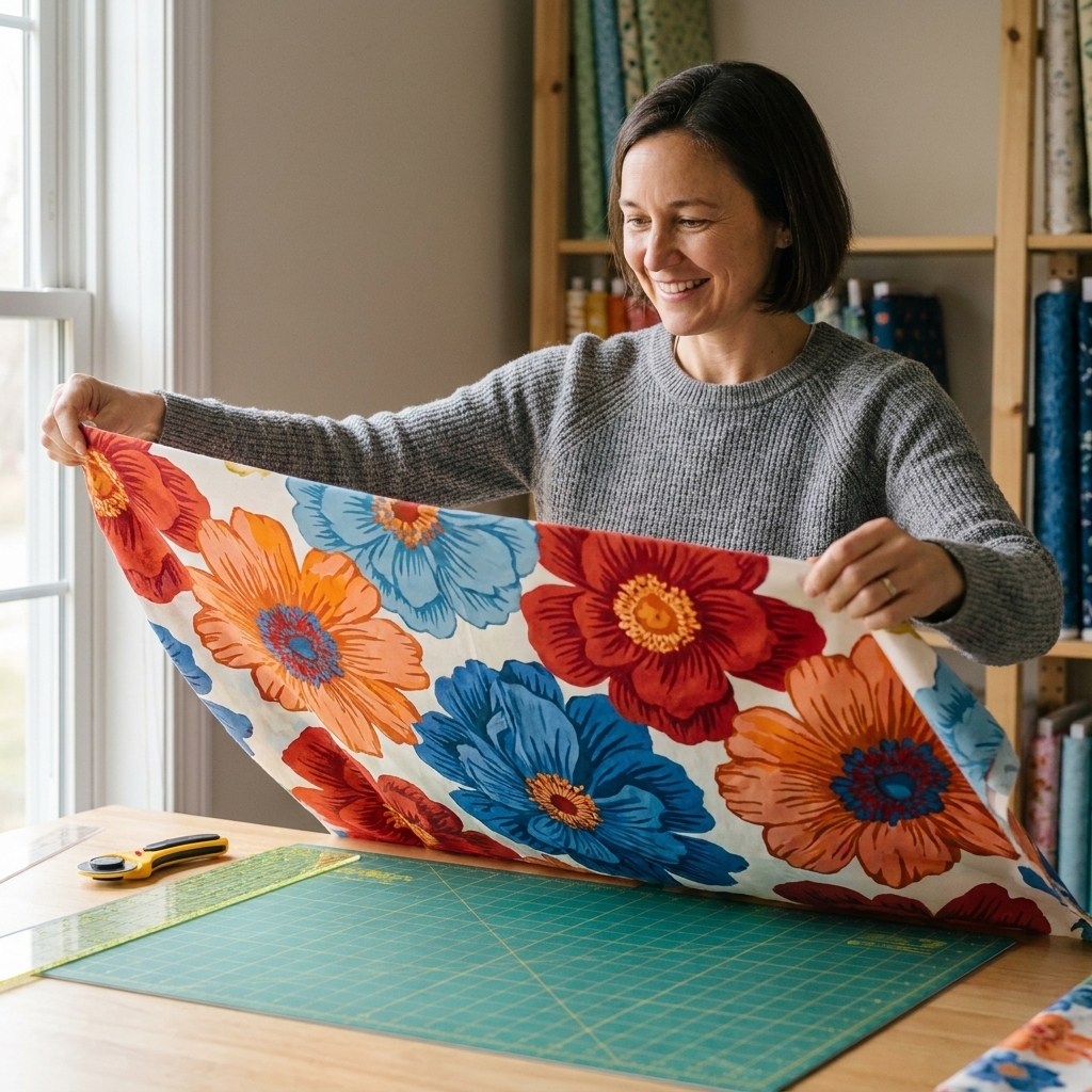
Here is a practical way to decide if a print is “too big” or “too small.” Lay a fabric over your cutting mat and imagine your typical cut size.
- Tiny pieces (1 to 2.5 inches): solids, blenders, tiny prints, narrow stripes, subtle textures.
- Medium pieces (3 to 6 inches): most quilting cotton prints tend to read clearly here and keep their motif.
- Large pieces (7 inches and up, or big background sections): large florals, bold geometrics, scenic prints, wide stripes.
If you love a large print but your pattern is tiny-pieced, use that fabric in the backing, the binding, or a border. It is not “cheating.” It is letting the fabric shine.
Balance prints
Print is about more than motif. It is also about how loud a fabric feels. Two fabrics can be the same color, but if one has high-contrast shapes and the other is softly mottled, they will behave very differently in a block.
Use visual volume
When I am choosing fabrics, I ask: How much is this fabric talking?
- Quiet: solids, shot cottons, tone-on-tone, low-contrast blenders.
- Medium: typical quilting prints, moderate contrast, repeated motifs.
- Loud: high-contrast geometrics, big motifs, novelty prints, sharp black-and-white patterns.
A quilt top usually needs more quiet fabrics than you think. Quiet fabrics are what let your loud ones feel exciting instead of exhausting.
Pick a hero, then support it
If you have one fabric you truly love, let it lead. Pull colors from it for the supporting fabrics, and keep the supporting prints simpler.
- Hero print: the one you would be sad to cut into tiny pieces.
- Co-stars: medium prints that share one or two colors with the hero.
- Extras: small prints and blenders that fill gaps without competing.
Stripes and directional prints
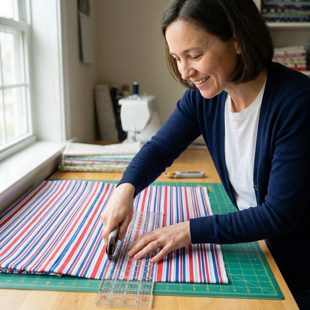
Directional fabrics can add beautiful energy, but they can also create visual fuss if the direction flips randomly.
- In random-scrap quilts, I treat direction as a feature. Let it tumble.
- In graphic quilts (like bold stars or modern blocks), keep stripes consistent within each block or within each row for a cleaner look.
- If you want the stripe effect without the stress, use non-directional textures and dots as your “stripe substitute.”
Use color value
If I could teach one fabric skill to every beginner, it would be color value. Value is how light or dark a color is, separate from what the color actually is. Value is what makes a star look like a star, even if you sew it in all kinds of different hues.
The squint test
Lay your fabrics out and squint until the prints blur. What you are left seeing is mostly value.
- If everything looks the same shade of gray when you squint, your quilt may read flat.
- If you can clearly see light, medium, and dark groups, you are on your way to strong contrast.
Try a black-and-white photo
Snap a quick photo with your phone and switch it to black and white. This removes the “but I love teal” bias and shows you the truth of value instantly.
Build value lanes
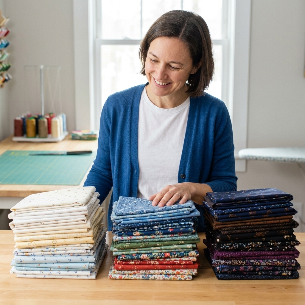
For most patterns, organizing your fabric pulls into three value families makes choosing pieces much easier:
- Lights: white, cream, pale pastels, low-contrast light prints.
- Mediums: most colors live here, including many saturated fabrics.
- Darks: navy, charcoal, deep jewel tones, black, high-contrast dark prints.
Then decide what the pattern needs. A classic star, for example, often relies on lights against darks. A soft, vintage look may sit mostly in light and medium with just a sprinkle of dark for definition.
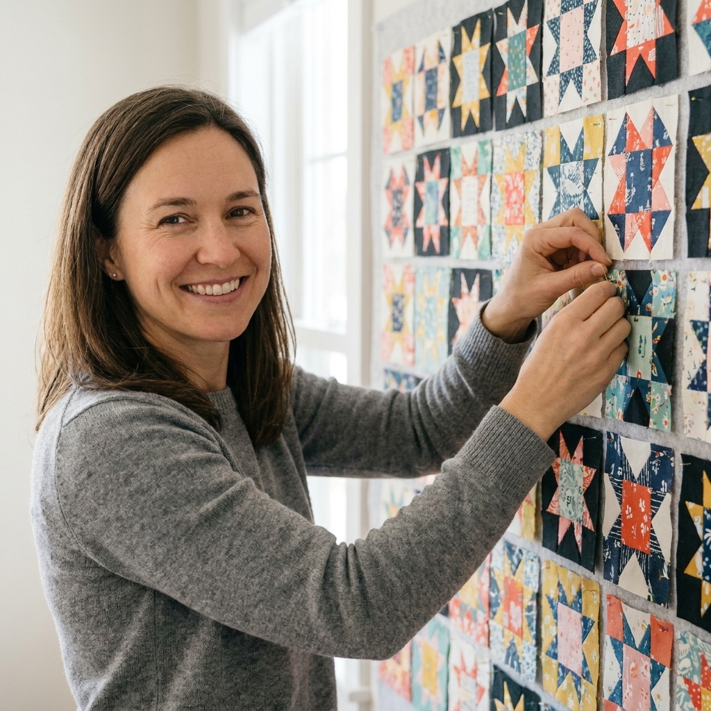
If you like a concrete placement example, try this: in a simple star block, keep the background consistently light, make the star points consistently dark, and let the center land in medium or dark depending on how bold you want the star to look.
Put it together
Here is the method I use at my own sewing table when I want results I can trust.
Step 1: Choose a focus
Pick one thing to anchor the quilt:
- a hero print you love
- a specific palette (like rust, cream, and sage)
- one high-contrast idea (like a light background with dark stars)
Step 2: Pull fabrics, then edit
Pull more fabrics than you need, then start removing anything that breaks your plan. Common fabrics to cut first:
- prints that are the wrong value even if the color is perfect
- multiple fabrics with the same scale and the same visual volume
- busy prints that fight the hero
Step 3: Add a resting fabric
If your pull feels hectic, add one calm fabric: a solid, a shot cotton, a linen-look print, or a tone-on-tone. This fabric is your breath between the busy bits.
Step 4: Audition at real size
A fat quarter can trick you. A 2.5-inch square tells the truth. Cut a few sample pieces (or fold fabric to the approximate size) and lay them in a mini block arrangement.
Step 5: Check value, then adjust
Do the squint test or the black-and-white photo. If the block disappears, swap in a fabric with a clearer light or dark value. In my experience, this is one of the quickest fixes you can make.
Step 6: Watch saturation and temperature
If your values look good but the pull still feels off, check two sneaky troublemakers:
- Saturation: one neon-bright fabric can jump forward even if its value matches everything else. If it feels loud, use it as an accent instead of a main player.
- Temperature: warm colors (reds, oranges, many yellows) and cool colors (blues, many greens) can clash if they are fighting for attention. A neutral or a bridge print that contains both warm and cool can help.
Step 7: Repeat on purpose
Cohesion often comes from repetition. If a fabric or color is important, show it again and again across the quilt top. As a simple rule of thumb, try to repeat a key fabric or color at least three times so it feels intentional, not accidental.
Common problems
Problem: My quilt looks muddy
Likely cause: Too many medium values, not enough lights and darks.
Fix: Add a true light (cream, low-volume print) and a true dark (navy, charcoal, deep jewel). Use them consistently in the block positions that need definition.
Problem: My quilt looks chaotic
Likely cause: Too many loud prints or too many high-contrast prints competing.
Fix: Replace two or three loud prints with blenders or tone-on-tones in the same color family. Keep one or two loud prints as accents.
Problem: My blocks disappear far away
Likely cause: Scale mismatch and/or value mismatch. A big print chopped small can look like static. Similar values melt together.
Fix: Put large-scale prints into larger pieces, or reserve them for borders and backing. Then strengthen the light versus dark positions in the block.
Quick practice
You do not need a full quilt to practice. Ten minutes with scraps can train your instincts.
Exercise 1: Make value stacks
Grab 15 scraps and sort them into light, medium, and dark. Take a black-and-white photo. If half your “lights” read medium, you just learned something useful.
Exercise 2: One block, three scale plans
Pick one simple block (half-square triangles are perfect). Sew three versions:
- all small prints
- small plus medium
- small plus one large “surprise” print in the bigger triangles
Lay them on the floor and step back. Your eyes will tell you which feels calm, which feels lively, and which feels unbalanced.
Exercise 3: The quiet swap
Take a fabric pull you like, then replace just one fabric with something quieter in the same color. Watch how the whole pull relaxes. That is the power of a resting place.
Stash-busting, but intentional
I love a scrappy quilt, but scrappy does not have to mean random. When you are sewing from your stash, choose one consistent thread that runs through the whole quilt:
- Value consistency: keep backgrounds reliably light and accents reliably dark
- Color consistency: limit to 2 to 4 main colors plus neutrals
- Print consistency: stick to one print mood, like modern geometrics or vintage florals
Then build cohesion by repeating a few favorites. If one fabric only shows up once, it can look like a mistake. If it shows up three or four times, it starts to look like a plan.
FAQ
How many prints should I use?
For a throw-size quilt, I often land around 8 to 16 fabrics, depending on the pattern. Think of that as a common range, not a requirement. More than the number, focus on variety in value and scale. A quilt with 10 fabrics can look busy if all 10 are loud, and a quilt with 30 fabrics can look calm if most are small-scale and low-contrast.
Do I need solids for a clean look?
No, but solids or near-solids make it easier to create resting space. If you do not love solids, try tone-on-tones, linen-look prints, shot cottons, or low-volume prints as a gentler alternative.
What is a low-volume print?
A low-volume print is a light fabric with a subtle pattern that reads almost like a solid from a distance. Think creamy backgrounds with tiny gray marks, pale text-like scribbles, or faint dots. They add texture without stealing the spotlight.
How do I keep a bold print from overpowering everything?
Give it space and support. Use the bold print in larger pieces where the design is recognizable, and pair it with quieter fabrics in the same color family. If it still feels like it is shouting, move it to the backing or binding and let it be the quilt’s secret delight.
One last reminder
Fabric selection is a skill, not a personality trait. Nobody is born knowing that two adorable florals will fight like siblings in the back seat. Audition, squint, snap a black-and-white photo, and remember that every “meh” quilt top teaches you something valuable for the next one. Your eye gets better every time you lay fabrics out and ask, What job is this fabric doing?